


Introduction
Let's explore the dynamics of the Dhaka stock market in 2022! This blog is your guide to understanding market trends, figuring out data patterns, and learning about Bangladesh's financial world. Using Python for analysis and pictures, I'll show you what's really happening with stocks. Join me on this journey to make sense of the Dhaka stock market. It's for traders, investors, and anyone curious about how markets work!
Dataset Overview
In this analysis, I used a big CSV file full of data to explore. The file has 49,159 rows and 7 columns, holding a bunch of info about the Dhaka stock market. It covers from January 2022 to June 2022 and looks at 412 different companies. The important columns in this data are Date, Name, Open, High, Low, Close, and Volume. This data gives us a good look at how the Dhaka stock market works, and we can dive deep into studying and understanding it.
Let's delve into the analysis!
- Importing Necessary Libraries
import numpy as np
import pandas as pd
import matplotlib as mlb
import matplotlib.pyplot as plt
import seaborn as sns
from scipy.stats import norm
from scipy.stats import zscore
NumPy (
import numpy as np): NumPy facilitates numerical operations with support for large arrays and matrices in Python.Pandas (
import pandas as pd): Pandas simplifies data manipulation and analysis through its DataFrame structure.Matplotlib (
import matplotlib.pyplot as plt): Matplotlib is a versatile plotting library for creating various visualizations in Python.Seaborn (
import seaborn as sns): Seaborn enhances statistical data visualization and works seamlessly with Pandas.SciPy Stats (
from scipy.stats import normandfrom scipy.stats import zscore): SciPy Stats offers functions for working with the normal distribution (norm) and calculating z-scores (zscore) in scientific computing.Data Ingestion
Using the read_csv() function from the pandas library in a .pd file within VS Code, we import the stock market data. Subsequently, the head() function is utilized to display the initial 5 rows, offering an initial glimpse into the structure and content of the Dhaka stock market dataset.
stock_data=pd.read_csv(r'/Users/DELL/Downloads/Stock_Market_Data.csv')
stock_data.head()
Result:

- Adjusting Datatypes
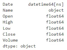
Before delving into the detailed analysis, it's essential to examine the data types, as discrepancies in them could disrupt further exploration. Let's check the data type by using the .dtypes command.
stock_data.dtypes
Result:

It's evident that the date type is currently in object format. We need to convert it to a date format for future calculations.
stock_data['Date']=pd.to_datetime(stock_data['Date'], dayfirst= True)
stock_data.dtypes
Result:
With the resolution of the issue, we can now proceed to in-depth analysis.
- Calculate basic summary statistics for each column (mean, median, standard deviation, etc.)
The code utilizes the describe() function to compute fundamental statistical measures for the DataFrame. This function provides key metrics such as count, mean, standard deviation, as well as minimum and maximum values for each numerical column in the dataset. These statistics contribute to a comprehensive understanding of the central tendencies and variability within the data.
print(stock_data.describe())
Result:

Explore the distribution of the 'Close' prices over time
# Convert the 'Date' column to a datetime type
top_ten_data['Date'] = pd.to_datetime(top_ten_data['Date'])

# Set the style of seaborn for better visualization
sns.set(style="whitegrid")

# Plot a histogram of 'Close' prices over time
plt.figure(figsize=(12, 4))
sns.histplot(top_ten_data['Close'], kde=True, bins=30, color='skyblue', stat='density')

plt.title('Distribution of Close Prices Over Time')
plt.xlabel('Close Price')
plt.ylabel('Density')
plt.show()
Result:

This code snippet transforms the 'Date' column to a datetime format, sets the Seaborn style to 'whitegrid' for improved visualization, and generates a histogram plot of the 'Close' prices from the DataFrame top_ten_data. The histogram includes a kernel density estimation curve, providing insights into the distribution of 'Close' prices over time. The plot is titled 'Distribution of Close Prices Over Time' and includes labeled axes for clarity.
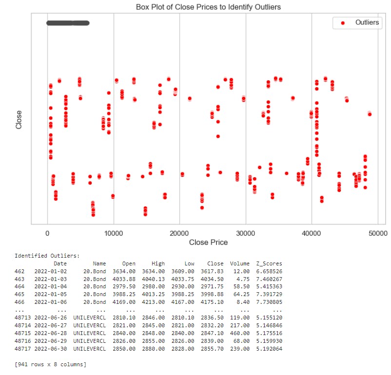
- Identify and analyze any outliers (if any) in the dataset
# Calculate Z-scores for 'Close' prices
stock_data['Z_Scores'] = zscore(stock_data['Close'])

# Identify outliers based on Z-scores (e.g., considering Z-score > 3 as an outlier)
outliers = stock_data[abs(stock_data['Z_Scores']) > 3]

# Set the style of seaborn for better visualization
sns.set(style="whitegrid")

# Create a box plot to identify outliers
plt.figure(figsize=(10, 6))
sns.boxplot(x=stock_data['Close'])

# Mark the identified outliers on the box plot
sns.scatterplot(x=outliers.index, y=outliers['Close'], color='red', marker='o', label='Outliers')

plt.title('Box Plot of Close Prices to Identify Outliers')
plt.xlabel('Close Price')
plt.legend()
plt.show()

# Display the identified outliers
print("Identified Outliers:")
print(outliers)
This code uses Z-scores to identify outliers in the 'Close' prices of a stock dataset, visualizes the distribution with a box plot, marks the outliers, and prints details about the identified outliers.
Result:
- Create a line chart for top ten companies to visualize the 'Close' prices over time
# Calculate average closing prices for each company
average_close_prices = stock_data.groupby('Name')['Close'].mean()

# Select the top ten companies based on average closing prices
top_ten_companies = average_close_prices.nlargest(10).index

# Filter the DataFrame for the top ten companies
top_ten_data = stock_data[stock_data['Name'].isin(top_ten_companies)]

# Plot the distribution of 'Close' prices for the top ten companies over time
plt.figure(figsize=(12, 6))

for company in top_ten_companies:
    company_data = top_ten_data[top_ten_data['Name'] == company]
    plt.plot(company_data['Date'], company_data['Close'], label=f'{company} Close Prices')

plt.title('Distribution of Close Prices Over Time for Top Ten Companies')
plt.xlabel('Date')
plt.ylabel('Close Price')
plt.legend()
plt.show()

This code segment provides a visual representation of the distribution of 'Close' prices over time for the top ten companies based on their average closing prices.
- Calculate and plot the daily percentage change in closing prices
top_ten_data = top_ten_data.copy()  #Create a copy of the DataFrame

top_ten_data['Daily_Percentage_Change'] = top_ten_data.groupby('Name')['Close'].pct_change()

# Plot the daily percentage change for each company
plt.figure(figsize=(12, 6))
for company in top_ten_data['Name'].unique():
    company_data = top_ten_data.loc[top_ten_data['Name'] == company]
    plt.plot(company_data.index, company_data['Daily_Percentage_Change'], label=f'{company} Daily Percentage Change')

plt.title('Daily Percentage Change in Closing Prices for Top 10 Companies')
plt.xlabel('Date')
plt.ylabel('Percentage Change')
plt.legend()
plt.show()

This code segment calculates and visualizes the daily percentage change in closing prices for the top ten companies over time, providing insights into the volatility and trends in their stock prices.
- Investigate the presence of any trends or seasonality in the stock prices
# Convert the index to a datetime type
top_ten_data.index = pd.to_datetime(top_ten_data.index)

# Get the top 3 companies based on some criteria (using to 3 as sample)
top_3_companies = top_ten_data['Name'].value_counts().nlargest(3).index

# Plot stock prices and rolling mean for each of the top 3 companies
for company_of_interest in top_3_companies:
    company_data = top_ten_data[top_ten_data['Name'] == company_of_interest]['Close']

    # Plot the stock prices over time
    plt.figure(figsize=(10, 4))
    plt.plot(company_data, label=f'{company_of_interest} Close Prices')
    plt.title(f'Stock Prices Over Time - {company_of_interest}')
    plt.xlabel('Date')
    plt.ylabel('Close Price')
    plt.legend()
    plt.show()

    # Calculate the rolling mean for trend analysis
    rolling_mean = company_data.rolling(window=30, min_periods=1).mean()

    # Plot the rolling mean
    plt.figure(figsize=(10, 4))
    plt.plot(company_data, label=f'{company_of_interest} Close Prices')
    plt.plot(rolling_mean, label=f'{company_of_interest} Rolling Mean (30 days)')
    plt.title(f'Stock Prices and Rolling Mean Over Time - {company_of_interest}')
    plt.xlabel('Date')
    plt.ylabel('Close Price')
    plt.legend()
    plt.show()
Result:
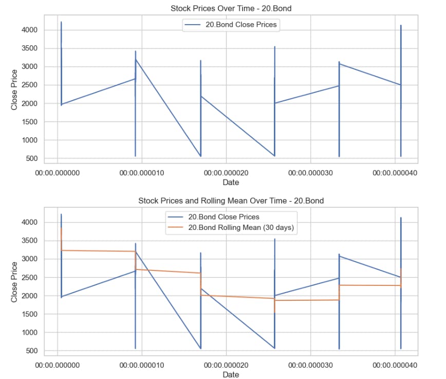

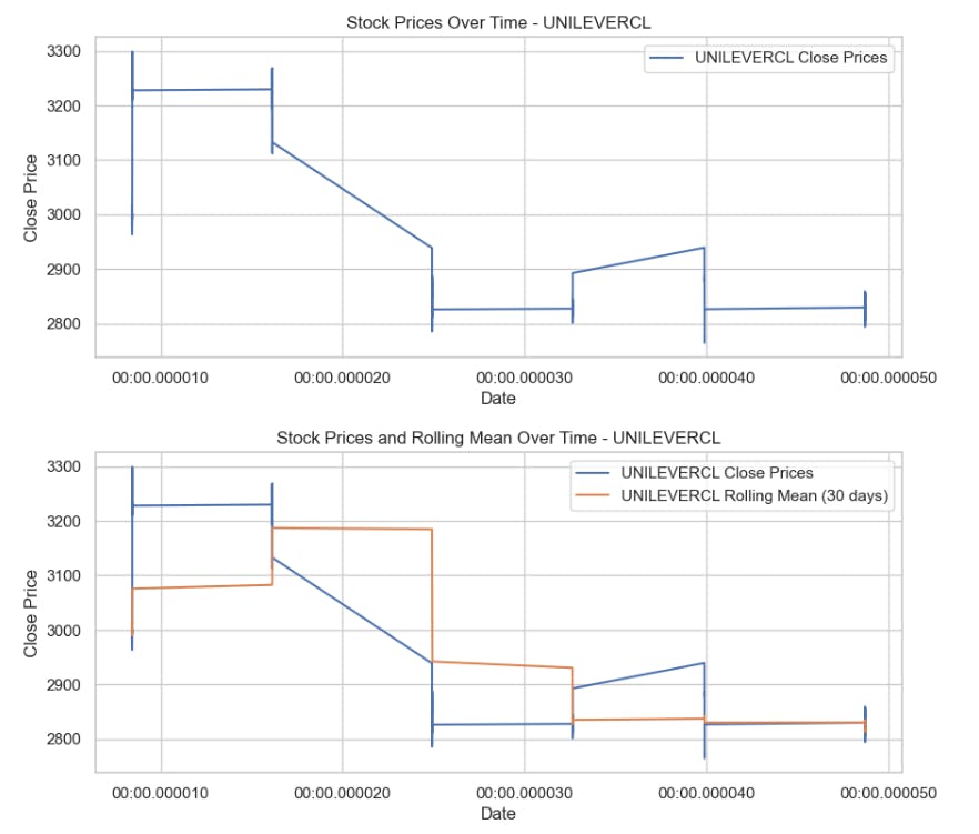
This code segment visualizes the stock prices and rolling mean over time for the top 3 companies, aiding in trend analysis and pattern identification.
- Apply moving averages to smooth the time series data in 15/30 day intervals against the original graph for top 5 companies
# Convert the index to a datetime type
stock_data.index = pd.to_datetime(stock_data.index)

# Identify the top 5 companies based on average closing price
top_5_companies = stock_data.groupby('Name')['Close'].mean().nlargest(5).index

# Plot the original close prices
plt.figure(figsize=(12, 6))
for company in top_5_companies:
    company_data = stock_data[stock_data['Name'] == company]
    plt.plot(company_data.index, company_data['Close'], label=f'{company} Original Close Prices')

# Apply a 30-day moving average for the top 5 companies
for company in top_5_companies:
    company_data = stock_data[stock_data['Name'] == company]
    moving_average = company_data['Close'].rolling(window=30).mean()
    plt.plot(company_data.index, moving_average, label=f'{company} 30-Day Moving Average', linestyle='--')

plt.title('Original Close Prices and 30-Day Moving Averages for Top 5 Companies')
plt.xlabel('Date')
plt.ylabel('Close Price')
plt.legend()
plt.show()
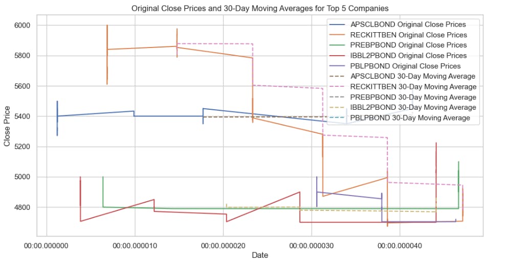
This code segment visually compares the original 'Close' prices over time with the 30-day moving averages for the top 5 companies, providing insights into trends and smoothing out short-term fluctuations.
- Calculate the average closing price for each stock
# Convert the index to a datetime type
stock_data.index = pd.to_datetime(stock_data.index)

# Calculate the average closing price for each unique stock
average_closing_prices = stock_data.groupby('Name')['Close'].mean()

# Display the average closing prices for every unique stock
print("Average Closing Prices for Every Stock:")
print(average_closing_prices)
Result:

Identify the top 5 and bottom 5 stocks based on average closing price
# Calculate the average closing price for each unique stock
average_closing_prices = stock_data.groupby('Name')['Close'].mean()

# Sort the stocks based on average closing price
sorted_stocks = average_closing_prices.sort_values(ascending=False)

# Identify the top 5 and bottom 5 stocks
top_5_stocks = sorted_stocks.head(5)
bottom_5_stocks = sorted_stocks.tail(5)

# Display the results
print("Top 5 Stocks based on Average Closing Price:")
print(top_5_stocks)

print("\nBottom 5 Stocks based on Average Closing Price:")
print(bottom_5_stocks)
Result:

Create a heatmap to visualize the correlations using the seaborn package
# Select the relevant columns
price_data = stock_data[['Open', 'High', 'Low', 'Close']]

# Calculate the correlation matrix
correlation_matrix = price_data.corr()

# Plot the heatmap
plt.figure(figsize=(8, 6))
sns.heatmap(correlation_matrix, annot=True, cmap='coolwarm', fmt=".5f", linewidths=.2)
plt.title('Correlation Matrix: Open, High, Low, Close')
plt.show()
Result:
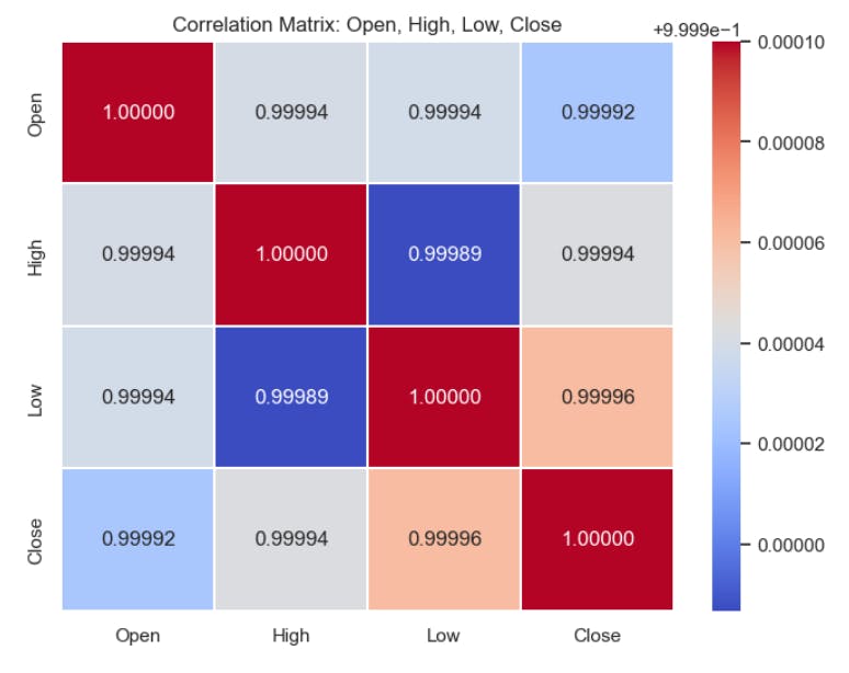
In this code snippet, we first select the relevant columns ('Open', 'High', 'Low', 'Close') from the stock_data DataFrame and store them in a new DataFrame called price_data. Then, we calculate the correlation matrix between these selected columns using the corr() method. Finally, we visualize the correlation matrix as a heatmap using Seaborn's heatmap() function, where each cell represents the correlation coefficient between two variables. The heatmap is annotated with correlation values, and the color map is set to 'coolwarm' to indicate the strength and direction of correlations. This visualization helps us identify relationships between different stock price variables such as opening, high, low, and closing prices.
Overall, this code snippet allows for a visual exploration of the relationships between the opening, highest, lowest, and closing prices of stocks in the Dhaka stock market using a correlation heatmap.
Acknowledgement:
I would like to extend my heartfelt gratitude to Bohubrihi for the invaluable learning experience and support provided during the completion of this project.